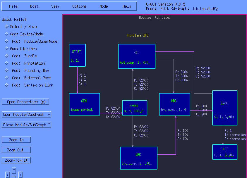
Software application data-flow-graph.
The first diagram below shows the software application data flow graph. The Threshold (T), Consume (C), and Produce (P) amounts are marked on the flow-graph arcs. The task-to-processor mapping assignment and task-primitive parameters are marked on the flow-graph nodes. Some parameters are macro-expressions which provides convenient specification and mapping.
The snapshot below shows the hardware architecture of the modeled system. It features CSIM's ability to display a hierarchical block-diagram as a flattened graph during simulation. The architecture diagram contained three levels of hierarchy. Each board contains 18 Sharc processors. The processors are networked together via Sharc-Links.

The above snapshot depicts the animation of instantaneous transfers and operations for the super-resolution and classification algorithms as mapped onto the four-board Alex system. The processor nodes are colored to indicate when they are performing specific tasks. The Sharc-links are colored to indicate when data is flowing through them. Note that because this is a flattened diagram, sub-diagrams were expanded in-place, so the I/O vias on the boundary of the sub-diagrams do not necessarily align with their connections on the outer diagram.
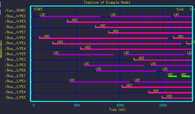
The following snapshot shows the resulting processing time-line from the simulation. The processing time-line shows when specific processor elements are performing tasks identified by the annotations.
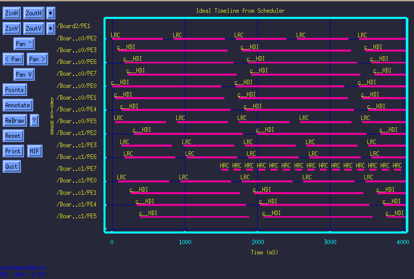
The time-line above shows the processing activity for a subset of the 72-processors. It was produced conveniently from the interactive XGRAPH tool by stretching a box around a region of the 72 processor time-line graph as shown on the left below. The time-line on the right shows the data-communications over-layed with the processing time-line. We call it a spider-web diagram due to its appearance.